What Are the Trending Colours in Kitchen Design?
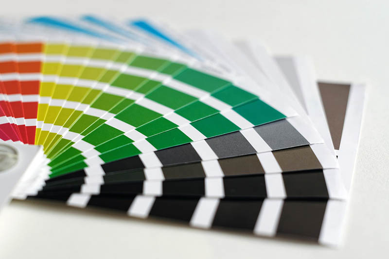
In kitchen design, colour schemes are important to consider. The colour scheme of the room will determine the atmosphere, what mood you are trying to create for yourself and your guests, and how much natural light there is in the space.
An older kitchen can give you a fair idea of what era a house was built as every decade has its telltale signs in its colour scheme and styles. Some trends will reappear over time, while others have been relegated to the interior design shame pile for all eternity.
Black and white: The perfect marriage
From the dawn of kitchen interior design to today, nothing is safer, more lasting, or more perfect than the marriage of black and white. This pairing of basics transcends all eras, fashions, styles, and designs and remains unbeaten as a kitchen colour pallet.
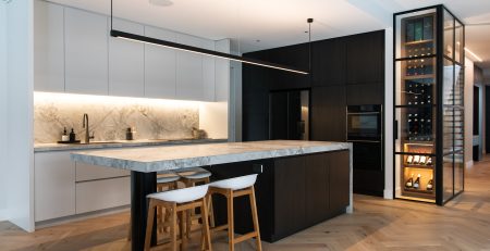
Whether you go for classic white walls and black features like black doors, drawers, and benchtops, or go for a stronger contrast with black walls and white elements, you cannot lose with this combo of basics.
Terrazzo tiling
Why just choose one colour when you can have many? Terrazzo tiles were created out of clay, marble offcuts, and waste and have been used as a style icon for over 500 years, particularly in Italian and other European designs.
This style can either offer a stark, multicoloured contrast to a dark colour pallet or help to break up a lighter-coloured aesthetic.
Pink for the win
Pink often gets overlooked as a kitchen colour option until people dig a little deeper and see how amazing it can look. Now, it’s easy to get caught up on pink, as the mind tends to wander to a pale baby pink or a loud hot pink.
However, there are many shades of pink to consider, including:
- Rosewood
- Coral
- Salmon
- Rouge
- Taffy
- Fuchsia and more
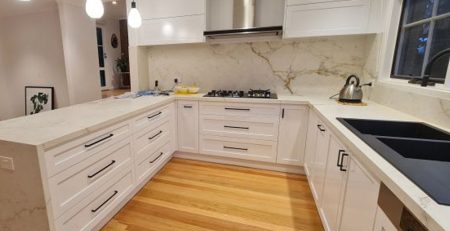
Pink tones can work wonders with marble or terrazzo tiles and white walls and even work well with polished concrete flooring, a popular current trend.
Glorious green
DIY renovators and professional kitchen designers on social media hubs like Instagram and Pinterest have gone crazy over green kitchens, especially with shades like teal. Green can complement earthy, natural design styles with lots of plants, woodgrain, and wooden floors.
Green shades like teal can also give a different feel in the daylight and at night, providing a mild but intriguing tonal change throughout the day.
The sky’s the limit with light blue
A light blue can be a great alternative to a classic white or beige and works particularly well in brightly lit rooms with lots of sunlight and in cottage and heritage-style designs. A light blue, like a baby blue or turquoise, can soften harsh edges and reduce the impact of dark colours like hardwood timber floors or dark open beams.
Red gets the go-ahead
Reds are trending strongly in current kitchen design, whether a scarlet red, rust, or deep burgundy; red is much more diverse than you may think.
A rust red can look great in more industrial or edgy kitchen designs, while deep burgundy can positively impact earthy natural finishes or wood-heavy country designs. Lighter reds can also be a good compromise when one of the deciding parties isn’t too keen on the pink trend.
Orange assault
Orange can be a bold choice; however, you can turn the dial down a notch by choosing shades like burnt orange. If your kitchen design or renovation features earthy tones, like terracotta tiles, for example, then a clay, fire, or cider orange can work wonders.
There are also more subtle tones on the orange scale that become more of a highlight than a feature, including cantaloupe, carrot, honey, or marigold.
Get lost in the grey
Brushed or polished stainless steel, which is a popular material used in kitchen appliances, can be tricky to colour match without the steel standing out like a sore thumb and seeming separate from your decor.
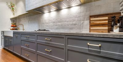
Light grey works best with steel, especially a Nordic-inspired grey. Grey can be a very sophisticated colour, especially where stainless steel and white are used.
If you want to add some contrast without going too bold, a darker grey can also be an excellent alternative to colours like reds, browns and greens.
A dark grey can also complement dark wood floors and tie them into a lighter surrounding paint scheme rather than looking out of place.
In the Navy
Navy blue can often escape people’s radar when selecting a colour scheme for a kitchen redesign. Navy blue may seem like a bold choice to a colour scheme novice; however, it is a colour that can be very versatile and is always a talking point.
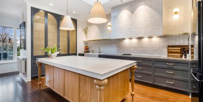
A deep navy blue is a perfect colour to use for cabinet doors, with a grey or light blue wall paint scheme, and can also adapt to a wide variety of flooring styles and types.
Trending colour combinations for kitchen design
While many people will choose a feature colour in their kitchen, current trends also focus on diverse colour, tone and texture combinations, which can transform a kitchen into something unique and memorable.
Some of our favourite colour and tone combinations in 2022 include:
- Grey, gold and metallics
- White, blue and green
- Blonde wood with black and white
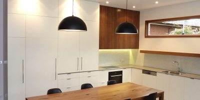
- Natural woods, warm whites and sage green
- Navy blue, gold and grey
- Black, citron and stainless steel
- Orange, black and grey and much more
Everyone has a unique taste and different eyes in which they interpret colour contrasts, and your kitchen colours will always be an individual choice.
H&H Cabinets: Excellence in kitchen design
If you are unsure about the type of colour scheme for your kitchen renovation, it is best to talk to a professional. If you live in Melbourne and are ready to begin your dream kitchen remodelling, speak to an award-winning kitchen renovation designer here at H&H Cabinets today.
We can help you make the most of the space you have, choose the best appliances for your home, and help you select a winning colour scheme you will love being in every day.
Call (03) 9808 4200 to speak to a consultant, or send your inquiry via our online contact form and one of our representatives will respond promptly.

